
The Brief
Overview and Goals
For this project, we aimed to design an app specifically for student beauty service providers across all SUNY campuses. Many students offer beauty services like haircuts, nails, waxing and eyelashes to make extra money, but they often struggle to manage appointments and attract new clients. Our research took place primarily at SUNY New Paltz, where we spoke to a friend, Ava, who does hair and nails. She shared her frustrations with juggling multiple social media platforms to promote her services and manage bookings. With her feedback, along with insights from another student provider, we set out to design an app where students could easily book beauty services and providers could showcase their businesses. Our goal was to simplify the process for everyone, helping students grow their businesses and assisting them with finding beauty services.
Team
Cleo Goldman - Art Director
Emely Moncion - Project Manager
Olivia Wilson - Presentation Designer
My Role
For LUXE, I collaborated with three classmates, sharing responsibilities across UI/UX design, art direction and project management. While I focused on the UI/UX design, creating user flows, wireframes and mockups to ensure the app was smooth and user-friendly, we all contributed to the visual design and organizational aspects of the project. It was a consistently collaborative experience, and we learned a lot while bringing the app to life.
Addressing the problem
To better understand the challenges student beauty service providers face, we met with Ava, a hairstylist, nail tech and student at SUNY New Paltz. Ava was kind enough to let us interview her about her experience running a beauty service on campus, and her insights were eye-opening. We discovered that Ava primarily relies on Snapchat to promote her services, attributing about 70% of her clients to her Snapchat stories, with the rest coming from word-of-mouth (20%) and Instagram (10%). In the past year, she’s had around 10 customers, but she expressed a strong desire for a better system to help her reach more people and streamline her business.
Survey results
To gain a broader perspective on the needs of students, we conducted a survey across SUNY campuses and received over 50 responses. The results reinforced our understanding of the demand for a campus-focused beauty service app. Students emphasized the importance of convenience, affordability, and trust when booking beauty services. The survey revealed that most students value features like photo galleries, reviews of providers' work, and streamlined communication for appointments. These findings helped us validate our idea and refine the app’s core features to better address the needs of both service providers and their clients.
Courtney
22
Oneonta, NY
Student
"It was a hassle finding someone who can do nails on campus… I need a wax soon, so I would like an easier search!"
Pain points
Difficulty finding reliable providers without personal recommendations.
Wasting time scrolling through different platforms looking for a provider.
Lack of trust dealing with unverified providers and unclear prices.
Needs
A better way to easily discover beauty service providers on campus.
An easier booking process.
Somewhere to view photos, reviews and availability all in one.
Lifestyle
Thrives on productivity and social outings.
Likes to experiment with new hairstyles and makeup looks.
Can scroll on Pinterest for hours at a time.
Personality
Energetic
Curious
Adaptable
Observant
Ava
20
New Paltz, NY
Student + Nail + Hair stylist
"While I do hair and nails to save up, the connections I’ve made with my customers have been so rewarding."
Pain points
Difficulty finding reliable providers without personal recommendations.
Wasting time scrolling through different platforms looking for a provider.
Lack of trust dealing with unverified providers and unclear prices.
Needs
A better way to easily discover beauty service providers on campus.
An easier booking process.
Somewhere to view photos, reviews and availability all in one.
Lifestyle
Thrives on productivity and social outings.
Likes to experiment with new hairstyles and makeup looks.
Can scroll on Pinterest for hours at a time.
Personality
Energetic
Curious
Adaptable
Observant
Personas
Courtney is the planner of the group, always looking for reliable waxing services on campus, highlighting a common frustration with accessibility. Ava, on the other hand, embodies LUXE's entrepreneurial spirit, offering hair and nail services to fellow students, building connections while saving up. These personas helped to ground LUXE in the realities of student life, making sure that every feature resonates with the audience’s daily challenges and needs.


Research, research and research
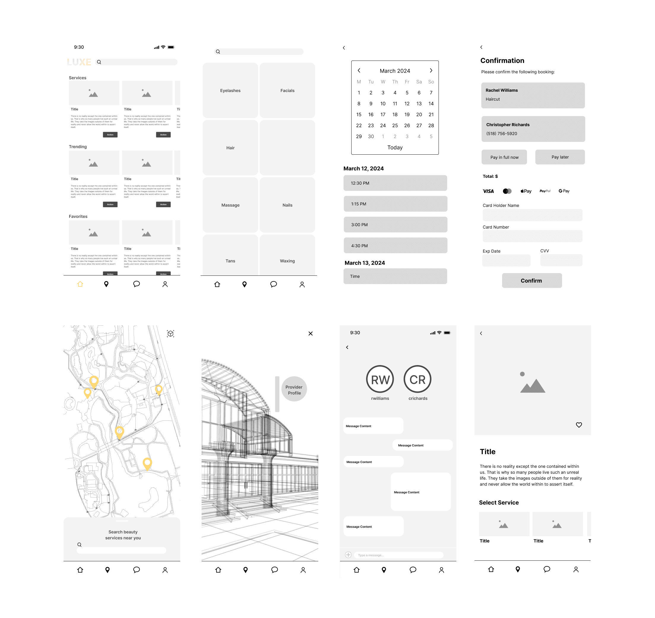
Features like an efficient booking process, user verification, easy navigation and provider spotlights were essential. These became some of the core features we focused on to make sure students could easily book beauty services and trust the providers. We needed to keep the design simple and user-friendly, balancing a modern app look with a straightforward experience.

The low-res stuff
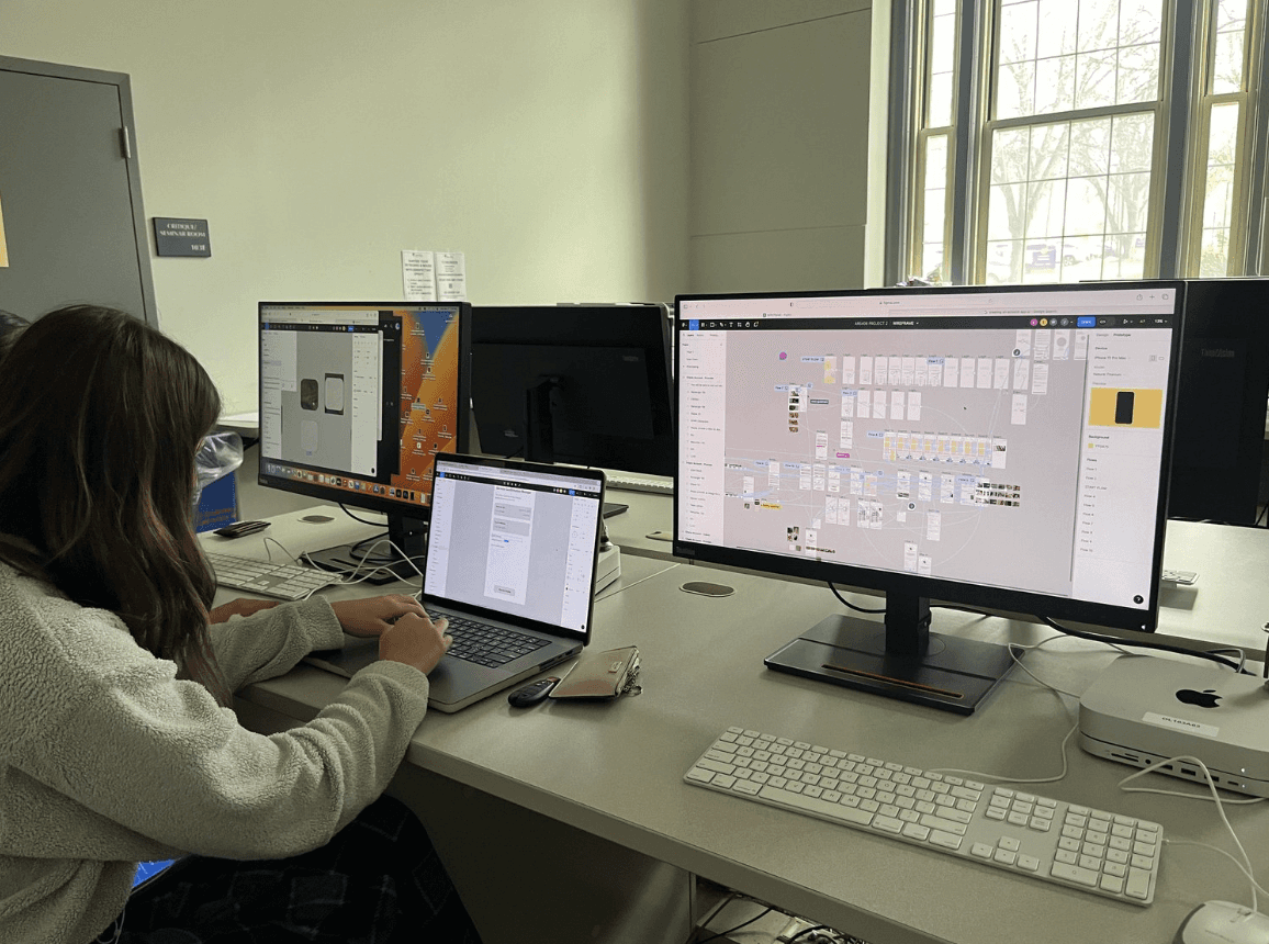
We started by creating a flowchart and user journey to map out the process. Then, we built wireframes and an initial prototype, which we had our classmates test for usability. We ran into some issues, like a lengthy booking process, an overwhelming main feed, and a problematic verification system during account creation. We took the feedback and refined our wireframes before moving on to the first round of designs. Each of us worked on our own version, and then we decided on a single design to move forward with for the final version.

Phase one
Each team member designed a set of screens to share their ideas. We reviewed each other’s designs, picked out the strongest features and combined them for the next phase. The challenge was merging different design styles into one cohesive look. We solved this by agreeing on a consistent design system, including colors, typography and layout rules, which guided our next round of development.

Phase two
In this phase, we combined our designs based on the consistent design style we had agreed on. However, we knew there was still work to do to refine the features and design. We focused on key pages and identified improvements like better UI, clearer provider verification, privacy options on map, and a clean, consistently laid-out home page.


By the end…
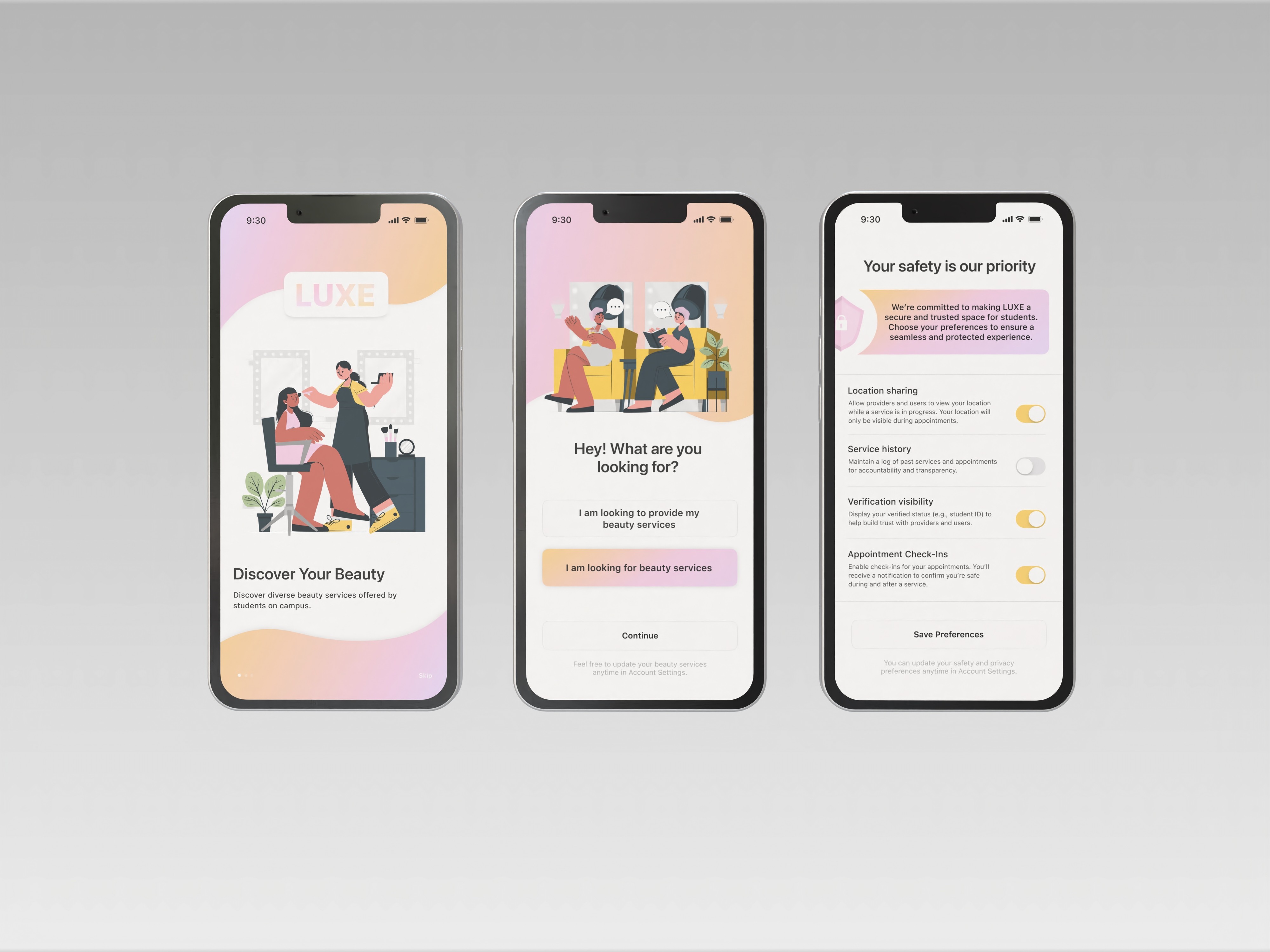
We finalized a design that incorporated all the feedback and revisions from earlier phases. A main focus was on user verification and safety, which remained our top priority since this is a location-based app. We implemented features like allowing users to toggle location on and off and ensuring location data is private unless an appointment is confirmed.
After another round of user testing with our classmates, we addressed issues like the framing of the homepage, which we redesigned for a more cohesive layout. For the provider page, we added widgets to make it more interactive and functional. We also ensured user profiles included essential components like verification, calendars and appointment reminders.
Ultimately, the emphasis on safety shaped much of the final design. We worked hard to make the app feel secure and intuitive, giving users the confidence to book services comfortably and efficiently.
Takeaways!
The biggest takeaway from this project was finding the balance between the clean, modern design we envisioned and catering to a niche audience of beauty providers and clients—many of whom gravitate toward more stylized designs. This became clear after talking to a few people and reflecting on our own experiences as students designing for other students.
Even with four of us working on it, there were so many things we got wrong in the beginning, and there’s still plenty of room for revision—there always will be. But that’s part of the lesson: learning to be okay with what we created within the timeframe we had.
This project taught me so much about the design process, from handling feedback to prioritizing user needs and working collaboratively. It was a super impactful experience for my UI/UX skills and a reminder that every project is a step toward improvement.
Resources utilized
SF Pro, SF Pro Symbols beta, Storyset by Freepik